Edit Your Homepage
By now, you should have a basic grasp of the editor and how it works. Youâve done some edits to your homepageâs content and learned to use the Global Color and Fonts settings. Now, youâre ready to make changes to every aspect of your homepage.
You will need to review and edit each element of your homepage individually. The focus will be on explaining the key settings you can utilize when editing the content.
In this unit, you will learn about all the main settings that you can use to edit your homepage.
Your Goal
Edit your homepage layout, content, and style.
Process overview
Learn about this topic
- This step aims to provide a brief overview of how a page is created, giving you a general understanding of the larger picture. It will help you navigate your work effectively when editing your homepage.
- You can create a page using different tools and routes.
Hereâs one option: - Create a new page and name it.
- Set Global colors and fonts to reuse across your site.
- Create the layout: Choose a premade layout (the Plus icon on the canvas) or drag and drop the container widget from the panel.
- Style the layout: Add backgrounds, borders, etc.
- Add content: Drag and drop widgets on the canvas and add content in their Content tab.
- Style the content: Go to the Style tab of each widget and change the style settings to fit your design.
- Position each widget: Top-level positioning is done using the containerâs settings.
- Go to the Advanced tab of each container and widget to fine-tune the elementâs positioning, behaviors, and animations.
- Go to the Theme Builder, create your header and footer, and set them to appear on the Page.
Edit the Layout
Learn about this topic
- When using Elementor, youâre not creating a design; youâre building a webpage. Your webpage must fit different screen sizes, something known as Responsiveness.
- To facilitate Responsiveness (and other website aspects, like Accessibility), Elementor requires you create a layout to hold content.
- The layout is created with Flex-Box containers and Grid containers. These boxes automatically adjust their size to match the size of the content they hold.
- When a container is added to the page, it creates a new area that can hold widgets.
- It can also hold another container (a parent container holds a child container). This allows you to easily create complicated layouts.
How to do it
- To edit the layout of your homepage, simply hover over the pageâs content, and you will see the settings icon for containers appear.
To access a child container settings, click its icon in the top corner.
To access a top parent container settings, click the handle at the top of the container. - Containers have many settings allowing you to easily align and rearrange your content.
[important_note] Learn more about Containers by watching the video playlist available in the additional resources of this step. [/important_note]
Â
More Resources
Playlist
10 Videos
5:44
3:49
3:48
3:23
3:54
3:54
3:25
3:46
2:32
4:17
Edit Widgets
How to do it
- Edit your pageâs widgets, one by one, by hovering on the pageâs content and clicking the widget icon to open its settings.
[simple_note] The widgetâs name appears on the top of the panel. [/simple_note] - Though each element has its own settings, many settings repeat in different widgets.
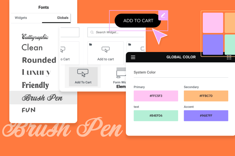
Example: Editing the color of elements looks the same regardless of it is a text, background, etc. - First edit the widgetâs content and then edit its style.
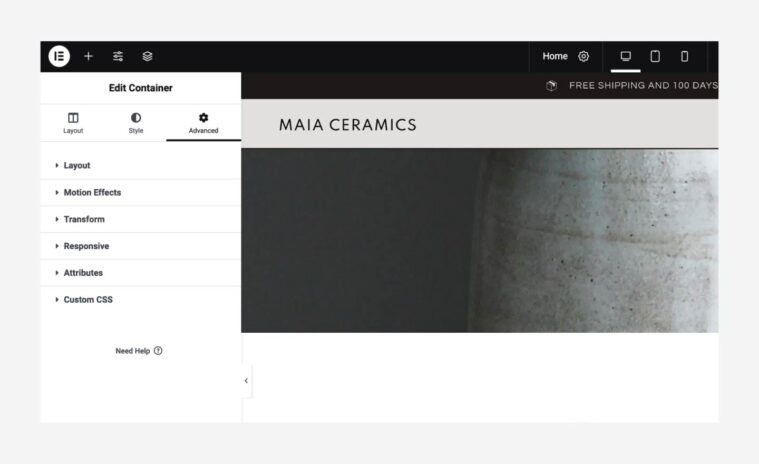
- The Advanced tab is identical for all widgets.
Some advanced settings require a deep understanding of CSS or code.
But the Advanced tab also contains design settings relevant to all widgets. - The Advanced tab includes layout settings and some design features: Motion Effects, Transform, Background, Border, and Mask (All explained in this unit).

- When you encounter a new widget, play with its settings to understand what it does and how to edit it.
- If you want to learn more about specific widgets or their settings, go to the Elementor Help Center and search for it.
Edit Positioning
Learn about this topic
- Positioning refers to how elements are positioned and arranged on a webpage. It involves determining where elements are located and how they are arranged in relation to other elements or the overall structure of the page.
- Positioning settings are available at both the layout level (containers) and content level (widgets) because the positioning of an element is dependent on its relationship with other elements.
- As a result, the positioning settings of one widget can impact the position of another widget. This can make positioning complex, often requiring some trial and error to achieve the desired design.
How to do it
- Use the Container settings to adjust the top-level positioning.
Go to the containerâs layout tab and use the Direction, Align, Justify, and Gap settings - Fine-tune widget locations using the Margins and Padding settings.
Go to the Advanced tab of each element to access these settings.
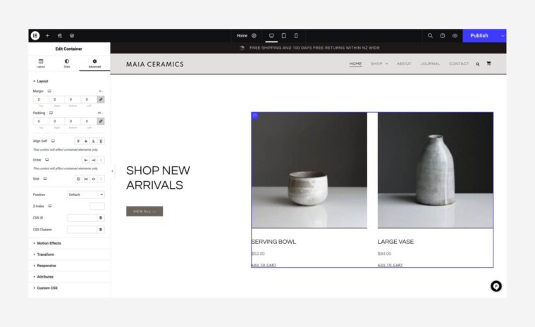
- You can add Margin and Padding on all sides of the element.
By default, theyâre linked together. You can unlink them to set the sides separately. - Padding controls the amount of space inside an element.
Example: Adding Padding to a widget adds space between the widgetâs content and the widgetâs area border. - Margin controls the amount of space around the element.
Example: Adding Margins to a widget adds space between the widgetâs border and the container that holds it. - Paddings and Margins use a negative value to reduce space.
- In the Advanced tab, the Transform setting can also be used to set the specific location of an element.
See âAnimationsâ in this unit for more details.
[important_note] Positioning usually requires trial and error. To learn more about positioning, see the resources below. [/important_note]
More Resources
Playlist
1 Videos
12:51
Edit the Background
Learn about this topic
- You can set a Background for containers, widgets or for the whole page.
- The background can be a color, image, gradient, video, or slideshow.
- You can set a Normal background that appears constantly or a Hover background that activates only when the user hovers over the element.
- For Containers, you can also set a Background Overlay (another layer).
- Here are all the available layers: Container background, Container background overlay, Widget background, and Widgetâs content.
How to do it
- To edit a widgetâs background, go to its Advanced tab.
- To edit the containerâs background, go to its Style tab.
- If you canât access a background or an image while editing, keep in mind that this background may be in any of the layers mentioned above:
Search the Widget background, Container background, or Background overlay. - To edit the pageâs background, click the cog icon at the center of the top-bar. This opens the Page Settings, then go to the Style tab.
The background setting enables you to choose a background that will be applied to the entire page. - To add an image as background, click the brush icon (âClassicâ), then click the image.
Edit Borders
How to do it
- To edit a widgetâs border, go to its Advanced tab.
- To edit a containerâs border, go to its Style tab.
- Set the Border Type you want and edit the Border Width.
- Change the borderâs shape from rectangular to circular by setting the Border radius.
- Shape Dividers, another border type, are special visual separations. They appear at the top or bottom of parent containers only.

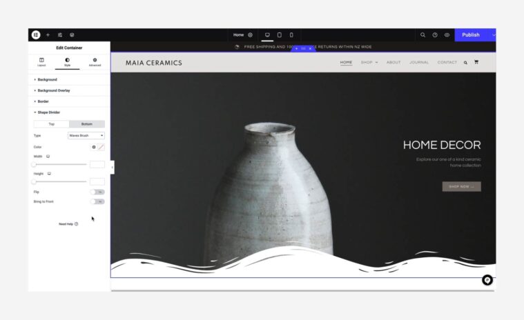
- To edit a shape divider, click the parent container handle to open its settings in the panel and go to the Style tab.
Animations
Learn about this topic
- Elementor offers many animation types.
Editing animations involves defining the rules for which user actions (such as hovering or scrolling) will activate the animation, as well as determining the specific movements that will occur. - When editing a kit, finding which animation is activated can be challenging.
- Here are guidelines on how to differentiate between the animations, and where to access their settings:
How to do it
- To determine if animations are active in your kit, click on the eye icon found in the Top-Bar to preview your page. Next, scroll down and hover over each element individually. If you observe any movement while scrolling or hovering, it indicates that the respective element has an active animation.
- Some widgets contain built-in animations (e.g., animated headlines, slides).
In these cases, the animation settings are located in the Content and Style tabs. - The Editor offers 3 types of animations: Motion Effects, Entrance Animations, and Transform.
These effects apply to the whole container or widget. - If the effect applies to the whole element, go to the elementâs Advanced tab.
- In Motion Effects, you can add Scroll effects and Mouse effects.
- Here, you can also edit the Entrance Animation. These animations are activated once the element enters the screen.
- Transform is used to change an elementâs appearance. You can use it to move an element.
As is, itâs not an animation, itâs a tool to position an element in an interesting way. - We consider Transform as an animation because when the Transform Hover state is activated, it becomes visible once the user hovers over the element, effectively turning it into an animation. Check if any animation is activated under Hover.
- If the animation applies before the page was loaded, itâs probably a Page Transition.
To Edit: Go to Site Settings â Page Transitions. - Some kits contain Lottie files, which are animation files uploaded to your library and displayed using the Lottie widget. You can use them as-is, delete them by deleting the Lottie widget, or upload your own Lottie files using the widget.
More Resources
Playlist
1 Videos